Tag Archives: design

My first online class!

About My First Class on Skillshare

My first class is about learning to use Adobe InDesign (which already comes bundled with many Adobe CC accounts) to make beautiful, clean, perfectly aligned contact sheets that are easily edited, updated, and exported to help you sell your work.
I created this course to help de-mystify InDesign. A lot of creatives, artists, and photographers pay for Adobe CC, but are not sure how to take advantage of all the software it brings. So, this is my effort in making Adobe's publishing software work for you. InDesign is a really robust piece of software and the perfect companion for Illustrator and Photoshop when you're looking to put it all together and publish your work.

I created this course to help de-mystify InDesign.
I've used InDesign to produce all kinds of promotional and informational materials throughout the years: business cards, mailers, postcards, booklets, portfolios, and contact sheets.
I focused on contact sheets as a way to explore InDesign and learn concepts that will easily translate to a lot of other projects. If you'd like to learn more, you can check out the class here on Skillshare.
I'd love to hear what you think!! And, if you've never used Skillshare before, here's a link for a  free 2 month trial of their premium membership - the link's limited to the first 10 who use it though, but take advantage while you can!

New gallery, New exhibit!


At the end of the summer, I secured a spot in a local co-op gallery, Carolyn Seiler & Friends in Cocoa Village.


So now some of my original paintings and giclee prints are available for sale, and you can come see my stuff in person if you're in the area! I also have an upcoming exhibition at the local library, the Merritt Island Library starting November 2nd! 


I'm very excited to show my latest paintings!


If you're further away, I'm currently working on an online shop so you can see my work and buy it if you would like a print! I'll post once it's open. In the meantime, though, if you'd like to buy my cards, I now have two retailers where you can always find them here: Blow! Birthday Cards (an online card shop that ships from the U.S.) 
CardIsle (various kiosk locations around the U.S.)

And lastly, I'll be moving my blog to my website just as soon as I figure out how! In the meantime, have a great week and Happy Halloween!

Bright & Cheery Tea Set


Project Brief: Design a cheery tea set for a Sunny client. 1x tea cup, 1x saucer, 1x napkin

The brief called for the design of a teacup, saucer, and napkin... but who could resist not designing the entire set?! Not I! I love tea!

What should it have on each piece? I'm not a big fan of the lacy, teensy, frilly flower on my tea sets as many traditional ones do.  And lately, I've been really enjoying working with traditional printmaking methods especially linocut. I made a bunch of patterns and arrangements using stamps I made on my own, and some I took into the digital realm and began testing repeats that way. I was really excited to use my recent patterns on something I'd love to own and see every day. I'm a big fan of tea and the paraphernalia that comes with drinking it.

So I set about sketching and came up with a concept that I'd love to have in my own home. The sketch gave me a general idea of how I'd present my work, and then I set about testing colors.
My first tests with pink...

Oh, I was so unhappy with this color combo! It's not me at all! I'd never buy it. After asking my fellow finches why I hated this so much, they reminded me I don't usually use pink in this way... and they're right, this is not really my shade of pink, nor do I own any pink tableware or pair it with sunshine yellow. Out went the pink!


Once the bright aqua and seafoam green went in, I was gelling. The work just came together so quickly. I knew I had to have sugar tongs and a sugar container, a little creamer, too! Finishing touches...


And lastly, I went to work balancing the tea-set. I wanted to have a nice mix and match tea set and napkins that could work in many different combinations. So the second saucer carried the more intense color, and the mugs match. The tea tray got a nice under-pattern and texture to match.

There you have it! Tea for two... a cuppa for me and one for you!

Bright & Cheery Tea Set


Project Brief: Design a cheery tea set for a Sunny client. 1x tea cup, 1x saucer, 1x napkin

The brief called for the design of a teacup, saucer, and napkin... but who could resist not designing the entire set?! Not I! I love tea!

What should it have on each piece? I'm not a big fan of the lacy, teensy, frilly flower on my tea sets as many traditional ones do.  And lately, I've been really enjoying working with traditional printmaking methods especially linocut. I made a bunch of patterns and arrangements using stamps I made on my own, and some I took into the digital realm and began testing repeats that way. I was really excited to use my recent patterns on something I'd love to own and see every day. I'm a big fan of tea and the paraphernalia that comes with drinking it.

So I set about sketching and came up with a concept that I'd love to have in my own home. The sketch gave me a general idea of how I'd present my work, and then I set about testing colors.
My first tests with pink...

Oh, I was so unhappy with this color combo! It's not me at all! I'd never buy it. After asking my fellow finches why I hated this so much, they reminded me I don't usually use pink in this way... and they're right, this is not really my shade of pink, nor do I own any pink tableware or pair it with sunshine yellow. Out went the pink!


Once the bright aqua and seafoam green went in, I was gelling. The work just came together so quickly. I knew I had to have sugar tongs and a sugar container, a little creamer, too! Finishing touches...


And lastly, I went to work balancing the tea-set. I wanted to have a nice mix and match tea set and napkins that could work in many different combinations. So the second saucer carried the more intense color, and the mugs match. The tea tray got a nice under-pattern and texture to match.

There you have it! Tea for two... a cuppa for me and one for you!

On a Holiday Roll

I feel like I'm an elf in Santa's workshop!  Over here at Adriprints Press, I've been working on many things in preparation for Surtex which is in just a few weeks.  One of the things I've been working on is my holiday-themed portfolio. It's nice to finally see it come together and be able to share it with you all!

Without further ado, here is my Adriprints Holiday Lookbook!


Just in case the embedded issuu viewer is not available through your viewing device, you can access the lookbook here via link too.

Ravelry Indie Designers Gift-Along 2015

I can't believe it's November! And, this means it's time for Ravelry's most amazing time of the year for independently published knitting patterns.  This year is no different, and I'm participating as a designer with 14 patterns on sale for 25% off their usual price...


AND, I'm offering a physical prize, too!  I'm offering a giclee (fancy term for high-quality inkjet) print of my knitterly illustration "6 Fabulous English Sheep Breeds".  So, if you're interested in winning it and/or hundreds of other prizes, check out the Ravelry Indie Design Gift-Along page full of information on the super-fun events to come.

  • Prizes
  • Games
  • Contests
  • Knit-alongs
  • Crochet-alongs
  • Machine-Knitalongs

All the details are on the Ravelry Gift-Along page and the magical gift code in order to make your 25% off of my knitting pattern dreams come true is there too!  Have a great time, and I'll see you there!

Scrapbooking: Greetings from the Lido Deck!

I am so happy with this one!  I couldn't believe I got it done on time to be considered for the Make Art That Sells weekly review either.  Our things finally arrived from Germany and it meant we were in super-unpack-cardboard-box-processing mode!  But, I was also in a "making mode" as well as "where the heck is my scanner mode"... and so I made and found my scanner at last.

Here is my work resulting from the theme we were given: vintage cruise ship correspondence.  It's a bit of a mash-up but I think between the chosen color palette and my brush pen illustrations which have a late 50's early 60's vibe in them, that it's enough to cover the vintage aspect.   I really wanted a Piña colada after drawing this... love those so much.


Summer School Illustrations

We're in the thick of summer here in Munich and it's been non-stop illustration, sewing, and knitting... okay, not so much the knitting because my current knit-along includes very warm yarn, lots of cables, and a steek, so I tend to wait for the weekend for that.

But I've been painting and illustrating and printing and working on building up my portfolio in preparation for Surtex 2016.  I enrolled in the Make It in Design course The Ultimate Portfolio Builder, and also their Summer School course.  These are much more self-directed than the Make Art That Sells courses, but I'm determined!  And, I've really appreciated the personalized feedback that the UPB course offered.  I got to hear directly from Khristian A. Howell herself about her thoughts on my work and website.  That was probably the most valuable 15 minutes of my career.  I found her feedback so helpful and it really makes me want to push my work to the next level!

Here is some of my most recent work...

(Mind you, these are mock-ups and none of my work is actually in production yet... YET!)


MATS A, Week 5: Gifts

As I posted my final assignment for my first MATS class in the flickr group, I was really sad.  I mean it!  I was so sad it is over.  There are still a few days of "wrapping it up" and the final review, but the 5 weeks of meaty assignments with endless potential...

Wait a sec, this is just the beginning!


Put those tissues away!  Although MATS A is over, it's time for me to shift gears and get ready for phase 2!  Transition time!  This is the toughest part I think, but I've got a pretty darned good toolkit and support network to help.

My next steps in this whole illustrator as full-time career move include:

  • refining my projects based on the feedback I received
  • assembling a portfolio with enough pieces in a marketable style
  • presenting my work to companies (and/or a representative)

I've been doing research since the start of the year on artist's representatives.  Between MATS and the Skillshare, Creative Live videos, Illustration podcasts, and the books that each of my teachers have recommended, I've got a fairly good idea of what it will take for this to work... and it's a lot of WORK! :D  But, I already knew that, and hard work is quite familiar to me, and I kinda like it.

Anyway, a review of Week 5...

Mini Assignment: identify and photograph or illustrate your favorite collections of items in your life. In my case, I have a lot of scissors... and looking at the photo I realize I missed two pairs in the kitchen. Oops!  I also have a huge collection of rubber stamps and many, many items relating to what I'll call "the paper arts" - illustration, drawing, painting, drafting, etc.
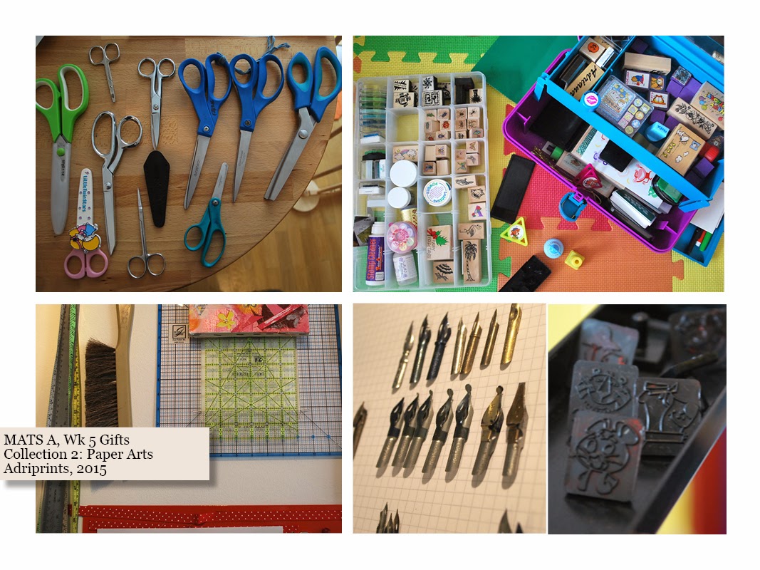
yes! an authentic Caboodles case, and Corn Flakes stamps from the 1960's

I have a cute collection of house-plants, too!  It's too bad I didn't have a balcony garden this year otherwise, I'd have used those too.  Hmm, I could get my photos of them from years past for another one of these...
 And then there's the fiber arts. This is just the tip of the iceberg, but my photographed collection includes my two favorite skeins of yarn in my stash, so many spools of thread, fabric scraps, patterns, and my all-time favorite buttons... 

When our big assignment came, I wasn't sure where to go with all of these photographs and illustrations.  I was overwhelmed with the sheer number of things I had scanned, isolated, color tweaked and sketched.  Overwhelm!

I showed this image to my fellow MAT-sians at the height of my overwhelm.  I've realized this is a typical stage in the artistic process. This is the part where you feel self-doubt and uncertainty and the judge part of the brain is telling you you're nuts for attempting this.  Don't let that judge win!  My classmates helped for sure.


So, I kept plugging away at it!  I thought of a way to bring my favorite collections together and here is my secret: key phrase.  I created a key phrase to help guide me.  My phrase for this piece was "tropical vacation yarn fetish".


I started by creating creatures that lived in this overlush place, these creatures had to be over the top.  I have been dying to do mash-up creatures and I thought this would be the perfect opportunity for a little Frankensteining!  Above you can see my first creature above.  It's a jackelope iguana, but it gets butterfly wings eventually.

Here's a .GIF of how the piece developed once I got going.

Just in case it doesn't loop on its own, click on the image to see the short GIF

The materials in the class for this week were really helpful.  There was a great list of businesses that are in the gifts market, templates, and wonderful life tips.  All in all, it was a really strong week with which to finish the course.  I'm so looking forward to MATS B in the fall!