Tag Archives: MATS

Bright & Cheery Tea Set


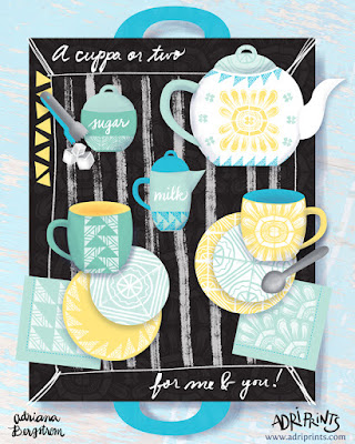
Project Brief: Design a cheery tea set for a Sunny client. 1x tea cup, 1x saucer, 1x napkin

The brief called for the design of a teacup, saucer, and napkin... but who could resist not designing the entire set?! Not I! I love tea!

What should it have on each piece? I'm not a big fan of the lacy, teensy, frilly flower on my tea sets as many traditional ones do.  And lately, I've been really enjoying working with traditional printmaking methods especially linocut. I made a bunch of patterns and arrangements using stamps I made on my own, and some I took into the digital realm and began testing repeats that way. I was really excited to use my recent patterns on something I'd love to own and see every day. I'm a big fan of tea and the paraphernalia that comes with drinking it.

So I set about sketching and came up with a concept that I'd love to have in my own home. The sketch gave me a general idea of how I'd present my work, and then I set about testing colors.
My first tests with pink...

Oh, I was so unhappy with this color combo! It's not me at all! I'd never buy it. After asking my fellow finches why I hated this so much, they reminded me I don't usually use pink in this way... and they're right, this is not really my shade of pink, nor do I own any pink tableware or pair it with sunshine yellow. Out went the pink!


Once the bright aqua and seafoam green went in, I was gelling. The work just came together so quickly. I knew I had to have sugar tongs and a sugar container, a little creamer, too! Finishing touches...


And lastly, I went to work balancing the tea-set. I wanted to have a nice mix and match tea set and napkins that could work in many different combinations. So the second saucer carried the more intense color, and the mugs match. The tea tray got a nice under-pattern and texture to match.

There you have it! Tea for two... a cuppa for me and one for you!

Bright & Cheery Tea Set


Project Brief: Design a cheery tea set for a Sunny client. 1x tea cup, 1x saucer, 1x napkin

The brief called for the design of a teacup, saucer, and napkin... but who could resist not designing the entire set?! Not I! I love tea!

What should it have on each piece? I'm not a big fan of the lacy, teensy, frilly flower on my tea sets as many traditional ones do.  And lately, I've been really enjoying working with traditional printmaking methods especially linocut. I made a bunch of patterns and arrangements using stamps I made on my own, and some I took into the digital realm and began testing repeats that way. I was really excited to use my recent patterns on something I'd love to own and see every day. I'm a big fan of tea and the paraphernalia that comes with drinking it.

So I set about sketching and came up with a concept that I'd love to have in my own home. The sketch gave me a general idea of how I'd present my work, and then I set about testing colors.
My first tests with pink...

Oh, I was so unhappy with this color combo! It's not me at all! I'd never buy it. After asking my fellow finches why I hated this so much, they reminded me I don't usually use pink in this way... and they're right, this is not really my shade of pink, nor do I own any pink tableware or pair it with sunshine yellow. Out went the pink!


Once the bright aqua and seafoam green went in, I was gelling. The work just came together so quickly. I knew I had to have sugar tongs and a sugar container, a little creamer, too! Finishing touches...


And lastly, I went to work balancing the tea-set. I wanted to have a nice mix and match tea set and napkins that could work in many different combinations. So the second saucer carried the more intense color, and the mugs match. The tea tray got a nice under-pattern and texture to match.

There you have it! Tea for two... a cuppa for me and one for you!

Hello 2016!

Whoah!  Where did 2015 go?  It just flew by I tell you!
I can't believe it was already a year ago I was sitting at my studio in Munich getting ready to get my illustration career back on track, and here I am now in California ready to launch the sales portion of my career!


In 2016, I hope to make some sales of my artwork as greeting cards and prints, as licenses on products and fabric!  Lots of work to do!  I'll keep you posted... and don't forget, you can always see my most recent work on instagram here.


Chicken Picnic


This is my final piece from the Make Art That Sells Course (Part B).  It was a revelation for me to just do what I do in response to a brief, and use my icons that were created on a whim earlier this year and then put it all together.  It's a revelation to just be in a flow and making work.

I asked my teammates from Finch & Foxglove for feedback and adjusted accordingly.  It's been really nice to be able to get into a groove and feel like you had a place to turn for a dialogue about your work.

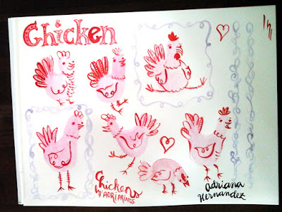
As for process, at the end of the summer I painted these chickens in watercolor and gouache.  This past week I drew most of the rest in marker, brush-pen, watercolor pencil, and gouache.  The textures I've been collecting all year, and I made some more.  I shared some of my textures recently on a live Periscope broadcast too!


I thoroughly enjoyed MATS B as it seems the topics suited me better.  In addition, though, it looks like I've grown some confidence between MATS A in March and MATS B in October.  Cheers to vast improvements and self-confidence!

Also, I'd like to invite you all to follow along with our Finch & Foxglove Advent Calendar starting December 1st.  Watch the advent calendar page here!

Santa Barbara Map

I'm still very new to this town, but here's my visual impression of the place so far...

Lots of people doing stuff out in the open all the time.  Bright sunny days, beautiful vistas, lots to do with your family or on your own. Oh, and lots of great cycling.  Have you been to Santa Barbara? What were your impressions?

Scrapbooking: Greetings from the Lido Deck!

I am so happy with this one!  I couldn't believe I got it done on time to be considered for the Make Art That Sells weekly review either.  Our things finally arrived from Germany and it meant we were in super-unpack-cardboard-box-processing mode!  But, I was also in a "making mode" as well as "where the heck is my scanner mode"... and so I made and found my scanner at last.

Here is my work resulting from the theme we were given: vintage cruise ship correspondence.  It's a bit of a mash-up but I think between the chosen color palette and my brush pen illustrations which have a late 50's early 60's vibe in them, that it's enough to cover the vintage aspect.   I really wanted a Piña colada after drawing this... love those so much.


Sweet Tidings to You!


It's only October, but the holiday card making season has just begun.  This week was the first week of MATS B (Make Art That Sells, Part B).  It was a good thing that the course started when it did as I got things somewhat in order and got back into the "making" groove here in our new home.  I set up a workspace on the kitchen table that came in the mail a few days before class began.  We put it together pretty quickly and cardboard boxes became work-space dividers, empty yogurt containers became brush holders, and old palettes from undergrad saved the day!


On a side note, though, does anyone else do that?  Do you leave things for your future self just in case x, y, or z happens?  I left a mini travel kit at my mom's house and unearthed a bunch of my tools last year when I visited during the holidays with the baby's first visit to the U.S.  And lucky for me that I did because I had a great little kit waiting for me this time around when I had nothing but my 2 suitcases for the baby and me after the move from Germany!

The first week of MATS focuses on paper (greeting cards in this case).  And our theme was holiday cookies.  I started the mini using my dipping pen and nibs with Windsor & Newton india ink.

Then, I did some icon painting with gouache.  And later I did some in Copic marker.


Next I put it together in Photoshop and Illustrator and worked on icon placement...


It seemed too brown to read as a holiday card, so I added blue and white to get that winter feeling in there.  Then, I added some extra cookie illustrations within the jar, added texture to a bunch of items (jar, sprig, thread, tag, etc.).  Finally, I put it all together in InDesign and added a few stationery accessories like the gift tags and possible stamps that I thought would work well with the remaining icons.  See the first photo for the final result.

MATS Bootcamp Recap

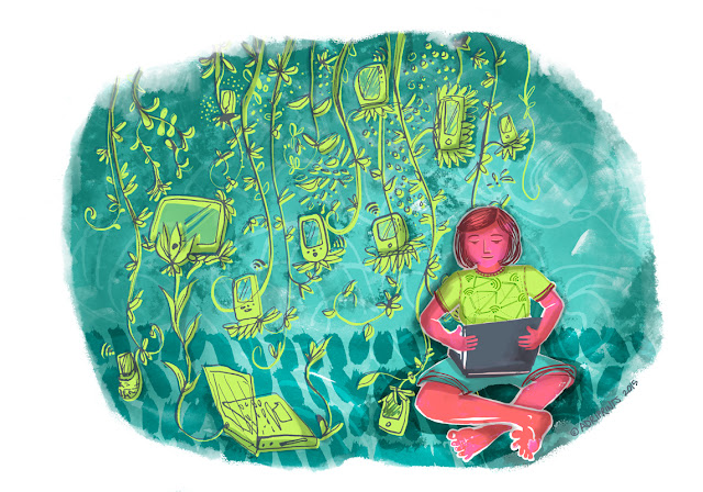
Another recap!  It's the end of the MATS Assignment Bootcamp unfortunately, and our last assignment was an editorial illustration.  We were given an article about digital nomad-ism and it felt pretty close to home.

I am definitely a digital nomad.  I spend lots of my time traveling back and forth from Germany to the U.S., but also to other parts of the European continent while still maintaining contact with clients and working on personal projects.  I related so much to the advice in the article... it's all about wi-fi and connectivity.

Traveling has been a constant in our lives, but now we're looking at repatriation as a reality.  We'll be moving back to the U.S. in the autumn and I simultaneously eagerly await the next chapter in our lives while mourning the separation from my long-time friends.  It's not our first goodbye to Munich (remember that Amsterdam 6 month dream sequence back in 2011?), and hopefully it won't be goodbye forever.

So where are we headed?  We're going to sunny California!  Don't worry, I'll be writing when I get there, but I'll first be stopping by my mom's place in Florida while we figure out where we'll be living in California.
- - -

Back to the MATS Bootcamp re-cap!

May brought us the crustacean sensation theme as I called it...
I was really pleased with the background pattern and came out with a stoneware plate or tray that I'd buy.


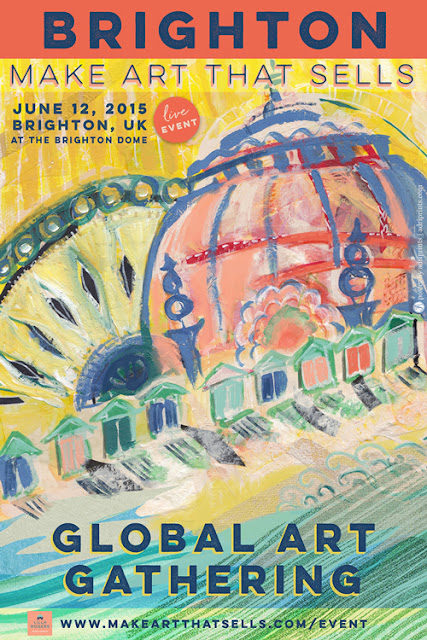
April was the Global Art Gathering poster.  I'm so glad I got to see Brighton in real life... I'd draw the dome differently now that I've seen it in person.  At the moment, it looks a bit like our American capitol buildings. I am still happy I did some painting, though.  The loose style came very naturally to me when used paint and collage.


March we worked on MATS Part A so Bootcamp was on  hiatus.

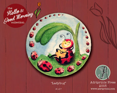
February we painted on wood.  We were riffing off of Lilla's plate collection and I had been drawn to a central character with foliage.  I'm loving the ladybug character, but I think I could push the whole thing a bit further in one painterly direction with more texture.  Something's missing and I don't know if it's just the mock-up or what.


I took February's assignment further and mocked up some plates too with some of my preliminary designs...


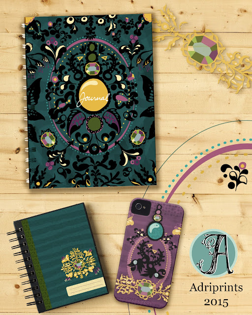
And January we worked on a journal cover. I feel like I've come a long way since our first assignment.  I was so nervous, and I clearly overworked the design now that I can see it with a fresh eye.  I enjoyed every minute of it, though!


MATS Part A – Overview and Review

5 weeks of illustrating like crazy!
 The following is a two part review of the Make Art That Sells course Part A as it was presented this year (2015).

1) A Review of the Make Art That Sells Course, Part A (from the heart)

MATS is a meeting place for people all around the world who are looking for their "tribe."  I know that's a word that's flung around a lot these days, but I don't have a better word for it... I guess I could say like-minded or similar seekers.  The community that is created after sharing our work, well, it's kind of intimate.  When you're working so hard on a dream that you hold dear, and you share it with others who have a similar dream, it's not difficult to see why we come together and why the course begins to take on a deeper meaning. MATS has a following because we feel connected to one another.

What about the work?  I can only speak for myself.  I have grown a lot and I think you can see it most in my final two assignments.  I used the five weeks of the course to try and discover a style within my work.  I wrote in my pre-course planner, "I have invested in this course because I want to make marketable art that feels true to me in a style that rocks!" So, I experimented with various mediums and line and hoped a style would jump out at me.  I can see a common thread running through all five pieces, mostly it's a color-based thread, but no obvious style jumped out at me.  The biggest thing I learned is to stop being slap-dash about my work.  I can see in my final piece a deliberateness that wasn't there before.  I am taking the lesson of deliberate mark-making as my biggest achievement in these past 5 weeks.  Did I achieve my original goal?  I think I kind of did.  I think all of my work feels true to me, but I don't think I'm far enough along in my illustration journey to say, "Yes! I love this style!  You, oh thick line and wavy brush, you will be my style from this time henceforward!" or whatever.  Not there yet...


2) A Review of the MATS Course, Part A by the numbers

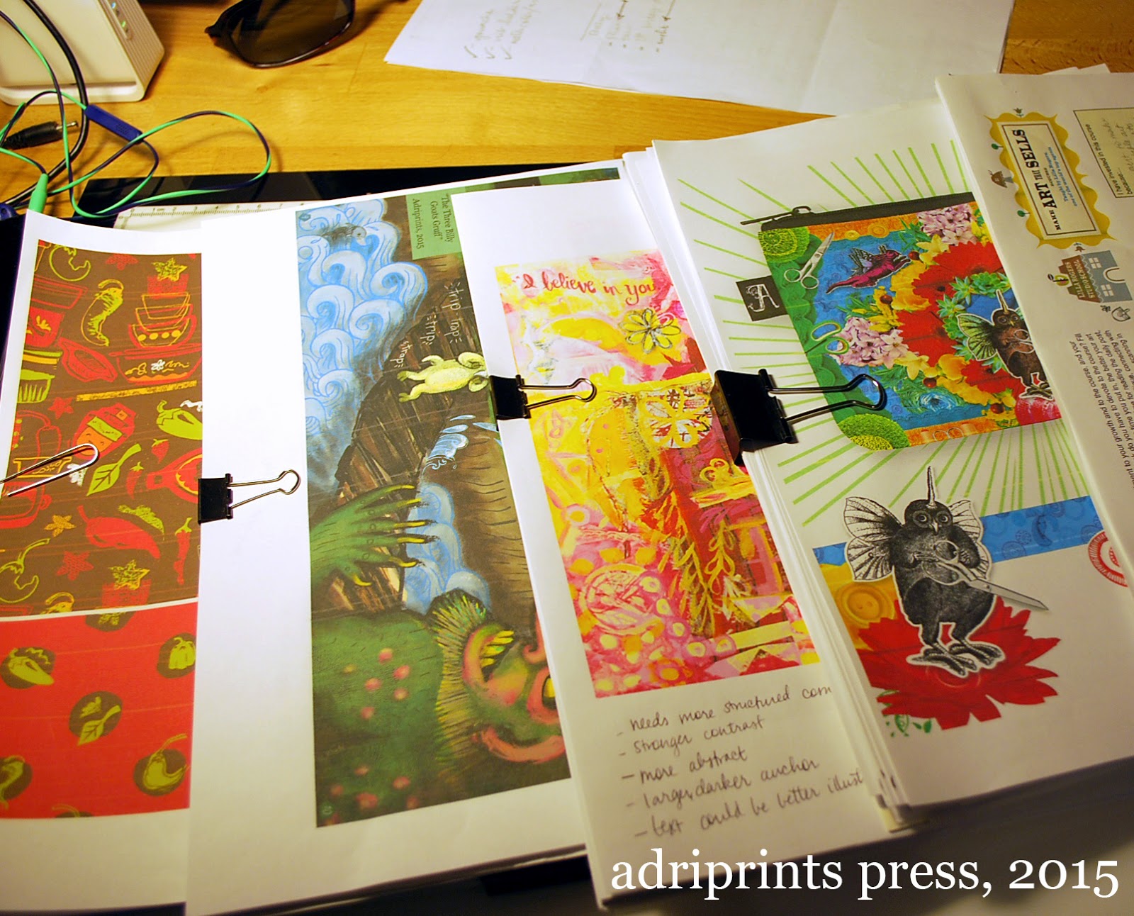
Let me give you an idea of how dense this course is.  I created an outline in order to keep track of all the materials after the final wrap-up post, and it took me 12 hours to do a cursory review and download the course materials.  TWELVE HOURS!!  If I were to collate all the pages and content of this course, it would amount to a very, very thick 3 ring binder.  It would be somewhere between 200 and 300 pages of material.  The first photo in this post is just a fraction of the content.  I printed out only what I intended to fill out or jot notes on.  And this is just Part A! There are several hours of videos including interviews with successful working illustrators and artists.  There are written interviews with experts in the business.  The course includes so many helpful tips, tricks, lists of possible clients, and a very large, supportive community (see part 1 of this review).

It is an intense course requiring the quick turnaround of 5 briefs from concept to layout/mock-up in five weeks.  Each project is broken up into a mini assignment at the start of each week, and then the fleshed out brief is given mid-week with the deadline of Sunday.  I loved the deadlines, and I happily met each one.  I loved being given the assignments, too.  It was nice having direction given to me. :)

And finally, many people who are reading this review are wondering about the reviews.  I will be straight with you.  My work never made it to the reviews.  Each week, Lilla Rogers chose 9 to 13 pieces to talk about.  There were over 150 people signed up for the course.  Many of these people, I'll say 20% are professionals.  Remember people take the course for all kinds of reasons including re-booting a career or refreshing a portfolio.  Some of my peers taking the course had already done editorial work with big name magazines and others had illustrated entire children's books, others were total beginners.  I was... in the middle.  So, I wasn't surprised that my work was not chosen for review.

On one level, of course I was disappointed!  I want to feel validated just as much as the next artist.  But, after every single review without fail, I looked at the checklist Lilla used to discuss the merits and drawbacks of each piece and I saw that even though my work had some of the elements listed, there were always a few missing.  The work reviewed often had a little something extra or something special about them that my work just didn't have (or doesn't have YET!).

It's also a matter of taste!  I know my work runs a bit dark (see troll and mash-up creatures), and Lilla represents some really joyful and happy art.  I'd like to make art that makes people feel joy, and I need to get back to that place.  I was there once.  Here's a throwback photo for you all.  This photo is from the RISD Graduate Student Publication "Making Something with Some Things" from 2008...

It's my entry into our class book.  I still haven't given up on that dream, I just got a little sidetracked is all.

So was it worth it?  Hell, yeah!


If you have any questions about the course or are considering it, but aren't sure, just send me an e-mail and I'll answer the best I can.  You can also write to the school itself, they're super helpful and friendly.