Tag Archives: process

My first online class!

About My First Class on Skillshare

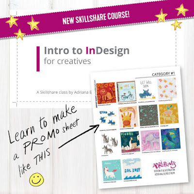
My first class is about learning to use Adobe InDesign (which already comes bundled with many Adobe CC accounts) to make beautiful, clean, perfectly aligned contact sheets that are easily edited, updated, and exported to help you sell your work.
I created this course to help de-mystify InDesign. A lot of creatives, artists, and photographers pay for Adobe CC, but are not sure how to take advantage of all the software it brings. So, this is my effort in making Adobe's publishing software work for you. InDesign is a really robust piece of software and the perfect companion for Illustrator and Photoshop when you're looking to put it all together and publish your work.

I created this course to help de-mystify InDesign.
I've used InDesign to produce all kinds of promotional and informational materials throughout the years: business cards, mailers, postcards, booklets, portfolios, and contact sheets.
I focused on contact sheets as a way to explore InDesign and learn concepts that will easily translate to a lot of other projects. If you'd like to learn more, you can check out the class here on Skillshare.
I'd love to hear what you think!! And, if you've never used Skillshare before, here's a link for a  free 2 month trial of their premium membership - the link's limited to the first 10 who use it though, but take advantage while you can!

Bright & Cheery Tea Set


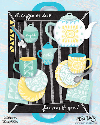
Project Brief: Design a cheery tea set for a Sunny client. 1x tea cup, 1x saucer, 1x napkin

The brief called for the design of a teacup, saucer, and napkin... but who could resist not designing the entire set?! Not I! I love tea!

What should it have on each piece? I'm not a big fan of the lacy, teensy, frilly flower on my tea sets as many traditional ones do.  And lately, I've been really enjoying working with traditional printmaking methods especially linocut. I made a bunch of patterns and arrangements using stamps I made on my own, and some I took into the digital realm and began testing repeats that way. I was really excited to use my recent patterns on something I'd love to own and see every day. I'm a big fan of tea and the paraphernalia that comes with drinking it.

So I set about sketching and came up with a concept that I'd love to have in my own home. The sketch gave me a general idea of how I'd present my work, and then I set about testing colors.
My first tests with pink...

Oh, I was so unhappy with this color combo! It's not me at all! I'd never buy it. After asking my fellow finches why I hated this so much, they reminded me I don't usually use pink in this way... and they're right, this is not really my shade of pink, nor do I own any pink tableware or pair it with sunshine yellow. Out went the pink!


Once the bright aqua and seafoam green went in, I was gelling. The work just came together so quickly. I knew I had to have sugar tongs and a sugar container, a little creamer, too! Finishing touches...


And lastly, I went to work balancing the tea-set. I wanted to have a nice mix and match tea set and napkins that could work in many different combinations. So the second saucer carried the more intense color, and the mugs match. The tea tray got a nice under-pattern and texture to match.

There you have it! Tea for two... a cuppa for me and one for you!

Bright & Cheery Tea Set


Project Brief: Design a cheery tea set for a Sunny client. 1x tea cup, 1x saucer, 1x napkin

The brief called for the design of a teacup, saucer, and napkin... but who could resist not designing the entire set?! Not I! I love tea!

What should it have on each piece? I'm not a big fan of the lacy, teensy, frilly flower on my tea sets as many traditional ones do.  And lately, I've been really enjoying working with traditional printmaking methods especially linocut. I made a bunch of patterns and arrangements using stamps I made on my own, and some I took into the digital realm and began testing repeats that way. I was really excited to use my recent patterns on something I'd love to own and see every day. I'm a big fan of tea and the paraphernalia that comes with drinking it.

So I set about sketching and came up with a concept that I'd love to have in my own home. The sketch gave me a general idea of how I'd present my work, and then I set about testing colors.
My first tests with pink...

Oh, I was so unhappy with this color combo! It's not me at all! I'd never buy it. After asking my fellow finches why I hated this so much, they reminded me I don't usually use pink in this way... and they're right, this is not really my shade of pink, nor do I own any pink tableware or pair it with sunshine yellow. Out went the pink!


Once the bright aqua and seafoam green went in, I was gelling. The work just came together so quickly. I knew I had to have sugar tongs and a sugar container, a little creamer, too! Finishing touches...


And lastly, I went to work balancing the tea-set. I wanted to have a nice mix and match tea set and napkins that could work in many different combinations. So the second saucer carried the more intense color, and the mugs match. The tea tray got a nice under-pattern and texture to match.

There you have it! Tea for two... a cuppa for me and one for you!

Sweet Tidings to You!


It's only October, but the holiday card making season has just begun.  This week was the first week of MATS B (Make Art That Sells, Part B).  It was a good thing that the course started when it did as I got things somewhat in order and got back into the "making" groove here in our new home.  I set up a workspace on the kitchen table that came in the mail a few days before class began.  We put it together pretty quickly and cardboard boxes became work-space dividers, empty yogurt containers became brush holders, and old palettes from undergrad saved the day!


On a side note, though, does anyone else do that?  Do you leave things for your future self just in case x, y, or z happens?  I left a mini travel kit at my mom's house and unearthed a bunch of my tools last year when I visited during the holidays with the baby's first visit to the U.S.  And lucky for me that I did because I had a great little kit waiting for me this time around when I had nothing but my 2 suitcases for the baby and me after the move from Germany!

The first week of MATS focuses on paper (greeting cards in this case).  And our theme was holiday cookies.  I started the mini using my dipping pen and nibs with Windsor & Newton india ink.

Then, I did some icon painting with gouache.  And later I did some in Copic marker.


Next I put it together in Photoshop and Illustrator and worked on icon placement...


It seemed too brown to read as a holiday card, so I added blue and white to get that winter feeling in there.  Then, I added some extra cookie illustrations within the jar, added texture to a bunch of items (jar, sprig, thread, tag, etc.).  Finally, I put it all together in InDesign and added a few stationery accessories like the gift tags and possible stamps that I thought would work well with the remaining icons.  See the first photo for the final result.